library(readr)
url <- "https://raw.githubusercontent.com/KarlssonLaboratory/mi8016-Research-Approaches/main/data/proliferation.csv"

# Import dataset
dat <- read_csv(url)Analysis of Variance - ANOVA
Comparison of multiple group means
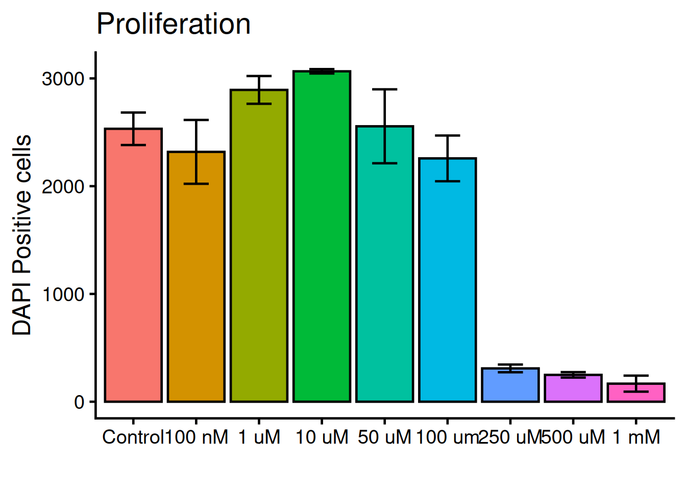
In the paper PFOS induces proliferation, cell-cycle progression, and malignant phenotype in human breast epithelial cells, 2018 (PFOS phenotype paper), the adverse effects of PFOS are tested on a human cell line (MCF-10F), in multiple doses and exposure times. The adverse effects were assessed by investigating phenotypes such as proliferation, invasion and migration.
Here, we will reproduce the statistics and the figure 1F. This figure shows the proliferation phenotype over mulitple doses of 72h PFOS exposure. Proliferation is measured by quantifying the cell nuclei with DAPI, a staining method.
TipCompare to the original
Keep the figure 1F open in a separate tab during the tutorial so can easily compare it to ours.
Important
All code are ran inside R. If you need to install R follow this tutorial.
Installing packages
We’ll be needing some basic packages to help us along the way. Install forcats, readr and ggplot2.
- 1
-
Install packages with
install.packages("<package-name>"), use quotes - 2
-
Load library with
library(<package-name>)
Import the data
Lets import the dataset of nuclei count. The dataset is found here. We will download it directly into R with the read_csv() function (readr packages)
Inspect the dataset with the head() and summary() functions:
1head(dat)- 1
-
head()shows the top 6 rows of the data frame
# A tibble: 6 × 2
  variable value
  <chr>    <dbl>
1 Control   2723
2 Control   2613
3 Control   2657
4 Control   2443
5 Control   2365
6 Control 23941summary(dat)- 1
-
summary()shows ranges and types for each column
   variable             value
 Length:54          Min.   :  73
 Class :character   1st Qu.: 288
 Mode  :character   Median :2245
                    Mean   :1793
                    3rd Qu.:2723
                    Max.   :3088
                    NA's   :1
TipWhat did you learn about the dataset?
The data frame is composed:
- 2 columns : named “variables” and “value”
- 54 rows : all numeric with 1 NAs
To inspect the data frame fully, type the data frames name!
Use the forcats function fct_inorder() to make the variable column in to factors (categorical) and in the order they appear.
library(forcats)
1dat$variable <- fct_inorder(dat$variable)- 1
-
forcats::fct_inordermakes the categorices of the column the order they appear.
Tip
What happens if you do not include dat$variable <- in the code above, and only write fct_inorder(dat$variable)?
Statistics
Lets compare the group means of the different doses to see if there is any significant differences! An Analysis of Variance (ANOVA) analysis will tells us if there is a difference between the tested groups, but not between which. For this we run a post-hoc (lat. after this) test. The Tukey-Kramer test is post-hoc test that will tell us between which groups there is a difference.
The aov() function runs an ANOVA analysis. The formula argument reads y ~ x, hence we use value ~ variabale. The summary() function will show us the overall result of the ANOVA:
model <- aov(formula = value ~ variable, data = dat)

summary(model)
Df Sum Sq Mean Sq F value Pr(>F)
variable 8 68450805 8556351 253.1 <2e-16 ***
Residuals 44 1487643 33810
---
Signif. codes: 0 '***' 0.001 '**' 0.01 '*' 0.05 '.' 0.1 ' ' 1
1 observation deleted due to missingnessThe Pr(>F) column holds the p-values. Here we can see that the model is significant. Lets found out between which groups. For this, run TukeyHSD() (Tukey Honest Significant Differences) test, with the model as argument. Print the results after:
results <- TukeyHSD(model)

results
Tukey multiple comparisons of means
95% family-wise confidence level
Fit: aov(formula = value ~ variable, data = dat)
$variable
diff lwr upr p adj
100 nM-Control -214.16667 -560.32902 131.995686 0.5401177
1 uM-Control 360.83333 14.67098 706.995686 0.0352279
10 uM-Control 533.30000 170.24186 896.358139 0.0006017
50 uM-Control 23.00000 -323.16235 369.162353 0.9999998
100 um-Control -274.66667 -620.82902 71.495686 0.2212183
250 uM-Control -2223.33333 -2569.49569 -1877.170981 0.0000000
500 uM-Control -2283.50000 -2629.66235 -1937.337647 0.0000000
1 mM-Control -2364.83333 -2710.99569 -2018.670981 0.0000000
1 uM-100 nM 575.00000 228.83765 921.162353 0.0000790
10 uM-100 nM 747.46667 384.40853 1110.524805 0.0000010
50 uM-100 nM 237.16667 -108.99569 583.329019 0.4028143
100 um-100 nM -60.50000 -406.66235 285.662353 0.9996733
250 uM-100 nM -2009.16667 -2355.32902 -1663.004314 0.0000000
500 uM-100 nM -2069.33333 -2415.49569 -1723.170981 0.0000000
1 mM-100 nM -2150.66667 -2496.82902 -1804.504314 0.0000000
10 uM-1 uM 172.46667 -190.59147 535.524805 0.8259647
50 uM-1 uM -337.83333 -683.99569 8.329019 0.0606303
100 um-1 uM -635.50000 -981.66235 -289.337647 0.0000119
250 uM-1 uM -2584.16667 -2930.32902 -2238.004314 0.0000000
500 uM-1 uM -2644.33333 -2990.49569 -2298.170981 0.0000000
1 mM-1 uM -2725.66667 -3071.82902 -2379.504314 0.0000000
50 uM-10 uM -510.30000 -873.35814 -147.241861 0.0011533
100 um-10 uM -807.96667 -1171.02481 -444.908528 0.0000002
250 uM-10 uM -2756.63333 -3119.69147 -2393.575195 0.0000000
500 uM-10 uM -2816.80000 -3179.85814 -2453.741861 0.0000000
1 mM-10 uM -2898.13333 -3261.19147 -2535.075195 0.0000000
100 um-50 uM -297.66667 -643.82902 48.495686 0.1433394
250 uM-50 uM -2246.33333 -2592.49569 -1900.170981 0.0000000
500 uM-50 uM -2306.50000 -2652.66235 -1960.337647 0.0000000
1 mM-50 uM -2387.83333 -2733.99569 -2041.670981 0.0000000
250 uM-100 um -1948.66667 -2294.82902 -1602.504314 0.0000000
500 uM-100 um -2008.83333 -2354.99569 -1662.670981 0.0000000
1 mM-100 um -2090.16667 -2436.32902 -1744.004314 0.0000000
500 uM-250 uM -60.16667 -406.32902 285.995686 0.9996864
1 mM-250 uM -141.50000 -487.66235 204.662353 0.9156789
1 mM-500 uM -81.33333 -427.49569 264.829019 0.9972570We see all the comparisons now. We are only interested in the comparisons with Control. Instead of doing this manually lets extract those comparisons computationally.
results is an object. We want the data frame with comparisons only. This is found in results$variable:
results$variable diff lwr upr p adj
100 nM-Control -214.16667 -560.32902 131.995686 5.401177e-01
1 uM-Control 360.83333 14.67098 706.995686 3.522791e-02
10 uM-Control 533.30000 170.24186 896.358139 6.017320e-04
50 uM-Control 23.00000 -323.16235 369.162353 9.999998e-01
100 um-Control -274.66667 -620.82902 71.495686 2.212183e-01
250 uM-Control -2223.33333 -2569.49569 -1877.170981 8.245626e-13
500 uM-Control -2283.50000 -2629.66235 -1937.337647 8.245626e-13
1 mM-Control -2364.83333 -2710.99569 -2018.670981 8.245626e-13
1 uM-100 nM 575.00000 228.83765 921.162353 7.902628e-05
10 uM-100 nM 747.46667 384.40853 1110.524805 1.035715e-06
50 uM-100 nM 237.16667 -108.99569 583.329019 4.028143e-01
100 um-100 nM -60.50000 -406.66235 285.662353 9.996733e-01
250 uM-100 nM -2009.16667 -2355.32902 -1663.004314 8.245626e-13
500 uM-100 nM -2069.33333 -2415.49569 -1723.170981 8.245626e-13
1 mM-100 nM -2150.66667 -2496.82902 -1804.504314 8.245626e-13
10 uM-1 uM 172.46667 -190.59147 535.524805 8.259647e-01
50 uM-1 uM -337.83333 -683.99569 8.329019 6.063031e-02
100 um-1 uM -635.50000 -981.66235 -289.337647 1.189730e-05
250 uM-1 uM -2584.16667 -2930.32902 -2238.004314 8.245626e-13
500 uM-1 uM -2644.33333 -2990.49569 -2298.170981 8.245626e-13
1 mM-1 uM -2725.66667 -3071.82902 -2379.504314 8.245626e-13
50 uM-10 uM -510.30000 -873.35814 -147.241861 1.153257e-03
100 um-10 uM -807.96667 -1171.02481 -444.908528 1.672878e-07
250 uM-10 uM -2756.63333 -3119.69147 -2393.575195 8.245626e-13
500 uM-10 uM -2816.80000 -3179.85814 -2453.741861 8.245626e-13
1 mM-10 uM -2898.13333 -3261.19147 -2535.075195 8.245626e-13
100 um-50 uM -297.66667 -643.82902 48.495686 1.433394e-01
250 uM-50 uM -2246.33333 -2592.49569 -1900.170981 8.245626e-13
500 uM-50 uM -2306.50000 -2652.66235 -1960.337647 8.245626e-13
1 mM-50 uM -2387.83333 -2733.99569 -2041.670981 8.245626e-13
250 uM-100 um -1948.66667 -2294.82902 -1602.504314 8.245626e-13
500 uM-100 um -2008.83333 -2354.99569 -1662.670981 8.245626e-13
1 mM-100 um -2090.16667 -2436.32902 -1744.004314 8.245626e-13
500 uM-250 uM -60.16667 -406.32902 285.995686 9.996864e-01
1 mM-250 uM -141.50000 -487.66235 204.662353 9.156789e-01
1 mM-500 uM -81.33333 -427.49569 264.829019 9.972570e-01The comparisons are not in a column but in the row names:
rownames(results$variable) [1] "100 nM-Control" "1 uM-Control" "10 uM-Control" "50 uM-Control"
[5] "100 um-Control" "250 uM-Control" "500 uM-Control" "1 mM-Control"
[9] "1 uM-100 nM" "10 uM-100 nM" "50 uM-100 nM" "100 um-100 nM"
[13] "250 uM-100 nM" "500 uM-100 nM" "1 mM-100 nM" "10 uM-1 uM"
[17] "50 uM-1 uM" "100 um-1 uM" "250 uM-1 uM" "500 uM-1 uM"
[21] "1 mM-1 uM" "50 uM-10 uM" "100 um-10 uM" "250 uM-10 uM"
[25] "500 uM-10 uM" "1 mM-10 uM" "100 um-50 uM" "250 uM-50 uM"
[29] "500 uM-50 uM" "1 mM-50 uM" "250 uM-100 um" "500 uM-100 um"
[33] "1 mM-100 um" "500 uM-250 uM" "1 mM-250 uM" "1 mM-500 uM" grep() is a function that will match a string, lets use "Control" as the string. This will return which rows are matches:
rows <- grep("Control", rownames(results$variable))
rows
[1] 1 2 3 4 5 6 7 8Now lets only select those rows:
data <- results$variable[rows, ]Make the object into a data.frame()
data <- data.frame(data)Check the results!
data diff lwr upr p.adj
100 nM-Control -214.1667 -560.32902 131.99569 5.401177e-01
1 uM-Control 360.8333 14.67098 706.99569 3.522791e-02
10 uM-Control 533.3000 170.24186 896.35814 6.017320e-04
50 uM-Control 23.0000 -323.16235 369.16235 9.999998e-01
100 um-Control -274.6667 -620.82902 71.49569 2.212183e-01
250 uM-Control -2223.3333 -2569.49569 -1877.17098 8.245626e-13
500 uM-Control -2283.5000 -2629.66235 -1937.33765 8.245626e-13
1 mM-Control -2364.8333 -2710.99569 -2018.67098 8.245626e-13Focus only on the significant ones. subset() filters columns based on criterias:
subset(data, p.adj < 0.05) diff lwr upr p.adj
1 uM-Control 360.8333 14.67098 706.9957 3.522791e-02
10 uM-Control 533.3000 170.24186 896.3581 6.017320e-04
250 uM-Control -2223.3333 -2569.49569 -1877.1710 8.245626e-13
500 uM-Control -2283.5000 -2629.66235 -1937.3376 8.245626e-13
1 mM-Control -2364.8333 -2710.99569 -2018.6710 8.245626e-13Now we know which doses are significant!
Lets make a simple plot!
Important
Remember that dat holds our data for the proliferation dataset!
The plot() function can read a data frame and recognice that the variable column is factor and the value column is numeric. With this, a box-plot is generated with x = variable and y = value:
plot(x = dat$variable, y = dat$value)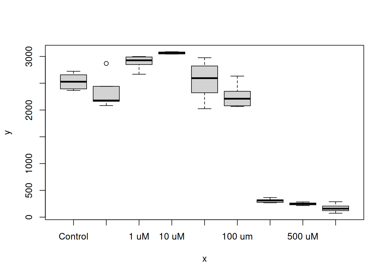
Tip
Try plot(dat) aswell, any difference?
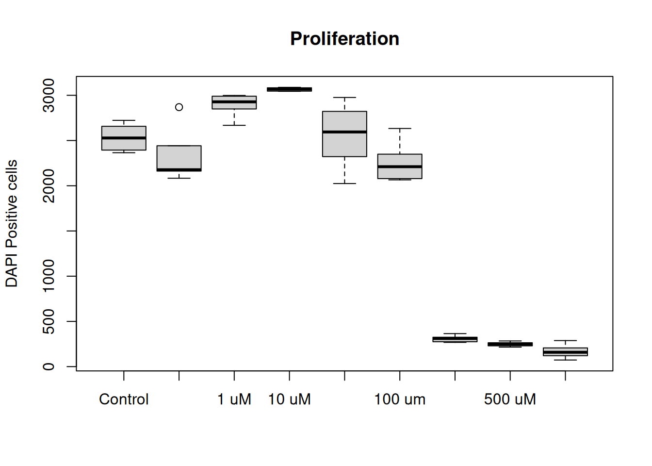
The plot() function also takes in additional arguments, like main, ylab and xlab. This will help us make the plot more understandable.
1plot(dat, main = "Proliferation", ylab = "DAPI Positive cells", xlab = "")- 1
- main = plot title, ylab = text on y-axis, xlab = text on x-asis
TipFunction arguments
All functions in R comes with documentation, where the function and all the arguments the function takes in are described. To open the documentation use the question mark ? before the name of the function, like ?plot will show:
plot                   package:base                    R Documentation

Generic X-Y Plotting

Description:

     Generic function for plotting of R objects.

     For simple scatter plots, ‘plot.default’ will be used.  However,
     there are ‘plot’ methods for many R objects, including
     ‘function’s, ‘data.frame’s, ‘density’ objects, etc.  Use
     ‘methods(plot)’ and the documentation for these. Most of these
     methods are implemented using traditional graphics (the ‘graphics’
     package), but this is not mandatory.

     . . .
To exit the documentation, press q.
Put a little flare on it
R comes with many packages to help customise plots. ggplot2 is the most popular one and builts on “layers” of geometic objects, called geom. The dataset is loaded via the ggplot() function and mapped via aesthetics (aes). Aesthetics contols x, y, outline colors, inside fill colors, sizes, shapes etc.
Tipggplot syntax
ggplot(<dataframe>, aes(x = <column_x_values>, y = <column_y_values>, colors = <column>)) +
  geom_<layer> +
  geom_<layer> +
  geom_<layer> +

  . . .
Lets style the plot with ggplot2! Run the code below:
# Ones per machine
#install.packages("ggplot2")

# Every R session
library(ggplot2)

1ggplot(dat, aes(x = variable, y = value, fill = variable)) +
2  geom_bar(fun = "mean", stat = "summary", color = "black") +
3  theme_classic(base_size = 18) +
4  labs(
    title = "Proliferation",
    x = "",
y = "DAPI Positive cells")- 1
-
By adding a plus sign
+multiple rows are chained fo the plot. - 2
-
geom_bar()uses the mean to calculate the top part of the bar. - 3
-
theme_classic()is on of many themes for decorating a plot.base_sizesets the overall size. - 4
-
labs()holds arguments for text inputs for title, x-axis, y-axis, etc.
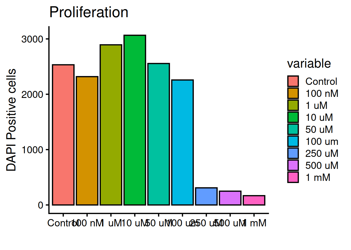
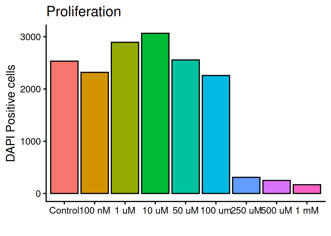
The legend is not needed, remove it with theme(legend.position = "none"):
ggplot(dat, aes(x = variable, y = value, fill = variable)) +
  geom_bar(fun = "mean", stat = "summary", color = "black") +
  theme_classic(base_size = 18) +

1  theme(legend.position = "none") +

  labs(
    title = "Proliferation",
    x = "",
y = "DAPI Positive cells")- 1
-
legend.positionis set to “none” and therefor not rendered. Default value islegend.position = "right".
We need to add “whiskers” to the plot, which shows mean +/- standard deviation, i.e the variance. Use geom_errorbar:
ggplot(dat, aes(x = variable, y = value, fill = variable)) +
  geom_bar(fun = "mean", stat = "summary", color = "black") +

  geom_errorbar(
    stat = "summary",
1    fun.min = function(x) mean(x) - sd(x),
2    fun.max = function(x) mean(x) + sd(x),
3    width = 0.4) +

  theme_classic(base_size = 18) +
  theme(legend.position = "none") +
  labs(
    title = "Proliferation",
    x = "",
y = "DAPI Positive cells")- 1
- Bottom whisker
- 2
- Top whisker
- 3
- Width of whiskars
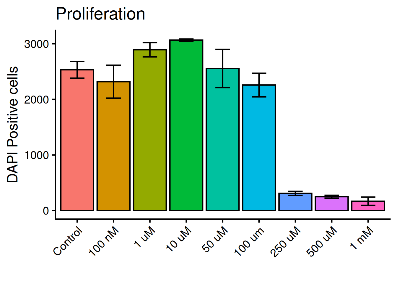
Tilt the x-axis text 45 degress. theme() holds all arguments for the plots general appearence:
TipFunction documentations
Check the doumentation: ?theme
Close with q.
ggplot(dat, aes(x = variable, y = value, fill = variable)) +
  geom_bar(fun = "mean", stat = "summary", color = "black") +
  geom_errorbar(
    stat = "summary",
    fun.min = function(x) mean(x) - sd(x),
    fun.max = function(x) mean(x) + sd(x),
    width = 0.4) +
  theme_classic(base_size = 18) +

  theme(
    legend.position = "none",
1    axis.text.x = element_text(angle = 45, hjust = 1)) +

  labs(
    title = "Proliferation",
    x = "",
y = "DAPI Positive cells")- 1
-
hjust = 1aligns the text to right-justifed.
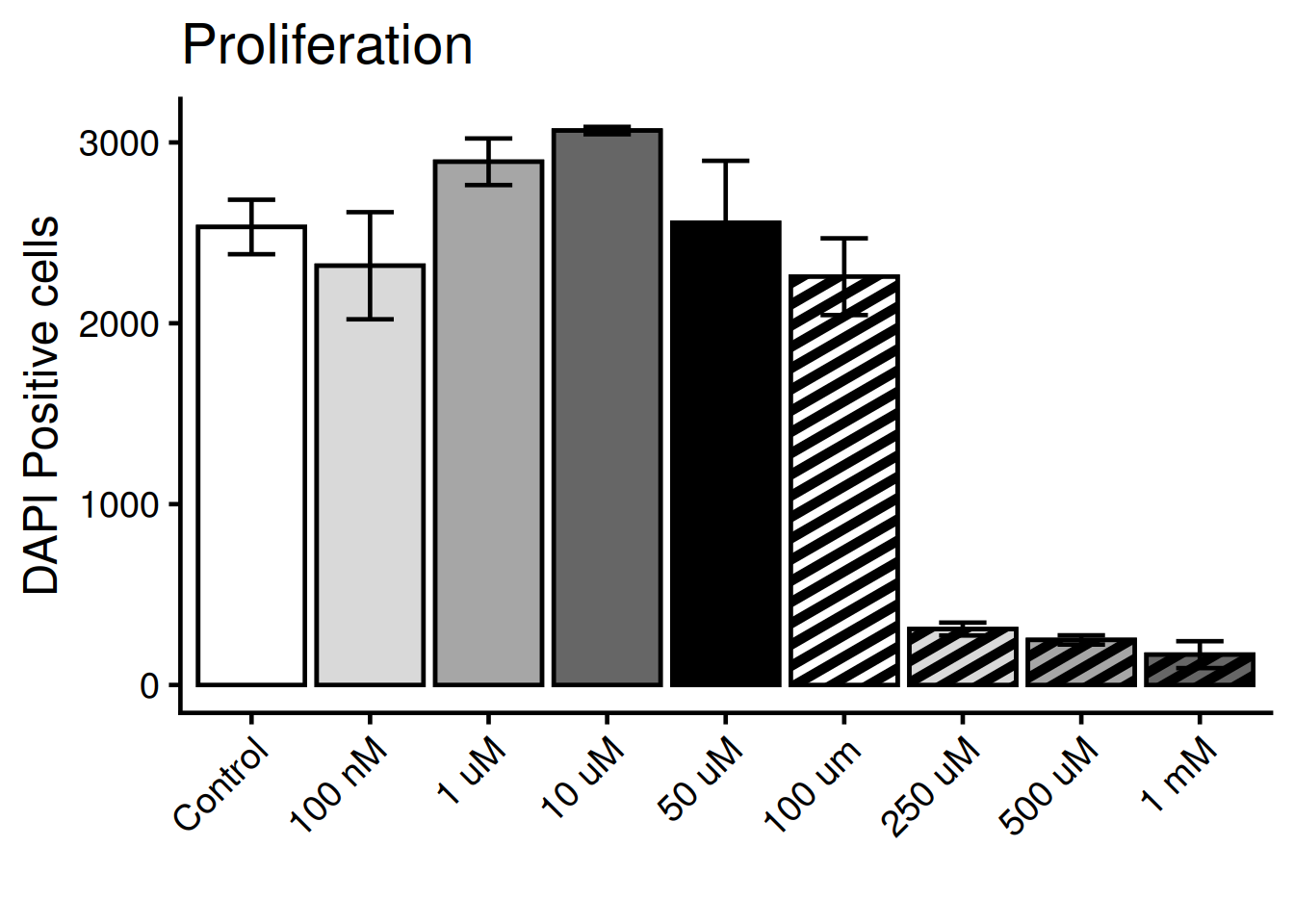
Color the bars according to the original figure. For this we need the package ggpattern and the function scale_pattern_manual().
# Ones per machine
#install.packages("ggpattern")

# Every R session
library(ggpattern)
Manually set the colors:
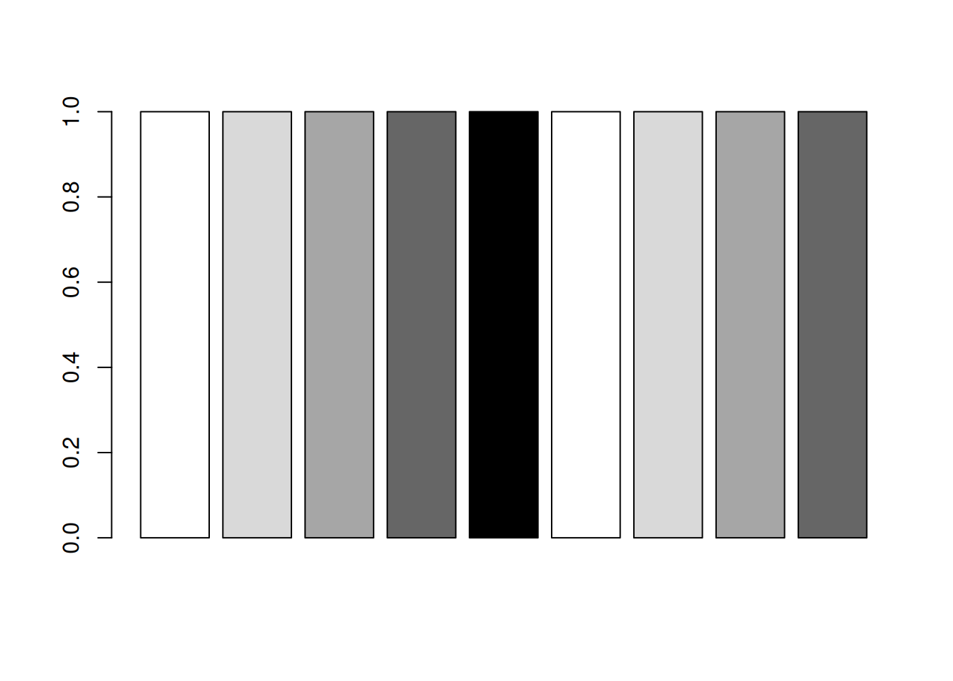
bar_colors <- c(
  "white",
  "grey85",
  "grey65",
  "grey40",
  "black",
  "white",
  "grey85",
  "grey65",
  "grey40"
)

1barplot(rep(1, length(bar_colors)), col = bar_colors)- 1
- Inspect the colors with a box-plot
Manually set the patterns / stripes:
bar_patterns <- c(
  "none",
  "none",
  "none",
  "none",
  "none",
  "stripe",
  "stripe",
  "stripe",
  "stripe"
)
Put it all together!
ggplot(dat, aes(
    x = variable,
    y = value,
    fill = variable,

1    pattern = variable)) +

  geom_bar(fun = "mean", stat = "summary", color = "black") +

2  geom_bar_pattern(
    fun = "mean",
    stat = "summary",
    color = "black",
    pattern_fill = "black",
    pattern_colour = "black",
    pattern_density = 0.4,
    pattern_spacing = 0.03
  ) +

  geom_errorbar(
    stat = "summary",
    fun.min = function(x) mean(x) - sd(x),
    fun.max = function(x) mean(x) + sd(x),
    width = 0.4) +

3  scale_fill_manual(values = bar_colors) +

4  scale_pattern_manual(values = bar_patterns) +

  theme_classic(base_size = 18) +
  theme(
    legend.position = "none",
    axis.text.x = element_text(angle = 45, hjust = 1)) +
  labs(
    title = "Proliferation",
    x = "",
y = "DAPI Positive cells")- 1
- Add the pattern aesthetics
- 2
- Add the pattern layer
- 3
- Set the fill colors manually
- 4
- Set the pattern values manually
NoteResources